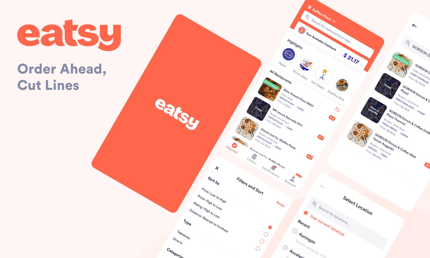
Eatsy - Discovery Home
Improving looks and experience on discovering foods and restaurants from home screen.
Role
Product Designer
Time
2019-2020
Team
Product, Engineer
Overview
Eatsy is a food ordering app which allows the diner to order ahead without waiting in line. Eatsy provide two services such as takeaway and dining-in at the restaurant. I joined Eatsy as Product Designer in 2019, a few months after they’ve expanded their team to Indonesia and partnered with other designer named Felix.

Problem
The very first problem we need to solve first is our home screen. It needs some improvement in order to gain more retention. We were looking at our users feedback and our data to gain more insight in which areas we could improve.
Most of the users find out that the home screen is not giving them so much information such as how good the restaurant is, where are they now, which restaurant having a promo or discount and filtering out their preferences. This occur user to use more effort in finding the restaurant or they just find the restaurant they know.
To sum it up, I decided to split it into 2 main problems for us at our home screen:
More effort to find the restaurant
The diners need more effort to find the best restaurant they could reach as there’s not enough information provided.
Not so much to see from home screen
Not so much interesting things to see from the home screen make users not coming back too often to find or ordering foods.
Goals
“The focus is to build more seamless experience in finding restaurant from the homepage and showing one of our unique selling proposition at the front”
Solutions
1.
Know Where You at
The current Eatsy app (2019-2020), doesn’t show where you at right now, instead you have to guess by seeing the restaurant area from card listing. Well, this thing makes confusion. Knowing their location would be helpful and also informative for user to sort out a place to order.
2.
More Choice, More Freedom
Finding restaurant sometimes can be hard. Users sometimes wanted to order at asian restaurant, coffee shop, snacks, or even find a halal foods. This thing can be easier if the user can filter out what they want instead of browsing a long list of restaurant.
3.
Availability Matters
Every card listing on our home screen looks the same. There’s no variety if the restaurant is having a discount or even how the user feels about their order to restaurant. Giving available status on current situation would make them more attracted to do transaction in any restaurant.
4.
Giving Contrast to Our Home
One of the way to giving contrast to our home screen is by adding Cashback feature to the front. This will turn an attention and also we would like to introduce this feature, even though this feature already exist before. But, by moving in to the front giving more reason to use Eatsy app more often.
Breakdown
After stating the solutions, now lets breakdown the design based on solutions stated. There are few part I can breakdown for home screen.
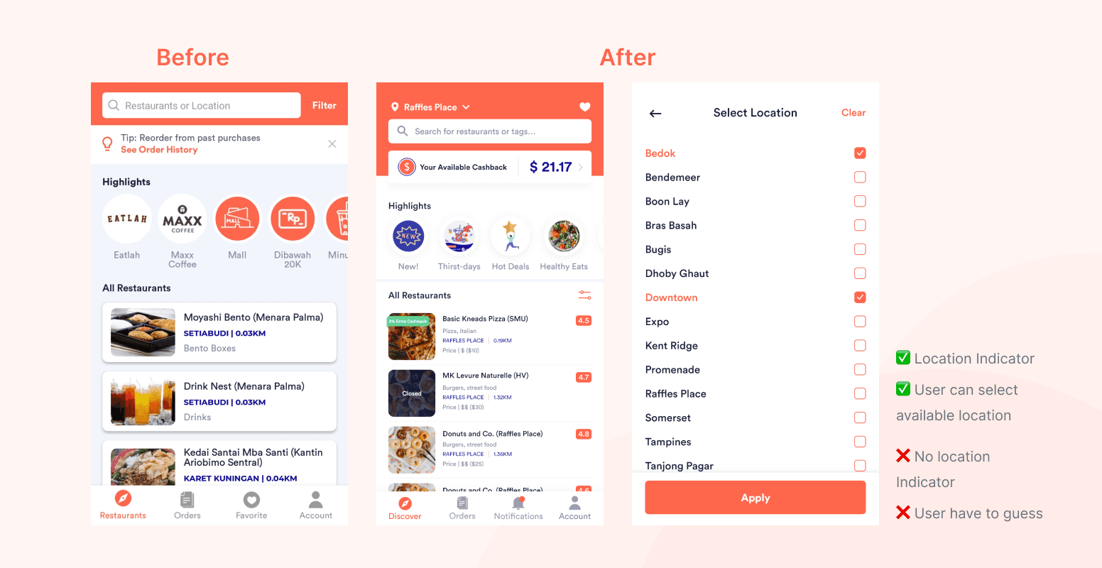
Location: As for 2019-2020, Eatsy only showing available location in which includes restaurants within the area. As the restaurant list still limited, we choose this way to show the location rather than showing exact location of a user. This to ease the filtering on area.
With only showing available area, Eatsy still not making the location clearly visible through home screen even though asking user a permission to use their location. You have to guess it or maybe looking at the restaurant card location. The location is hidden under filter which makes it giving more effort to find food in certain area.
By moving location filter to the front and able to select available area, user will notice in which area they’re now and able to find food in the area.
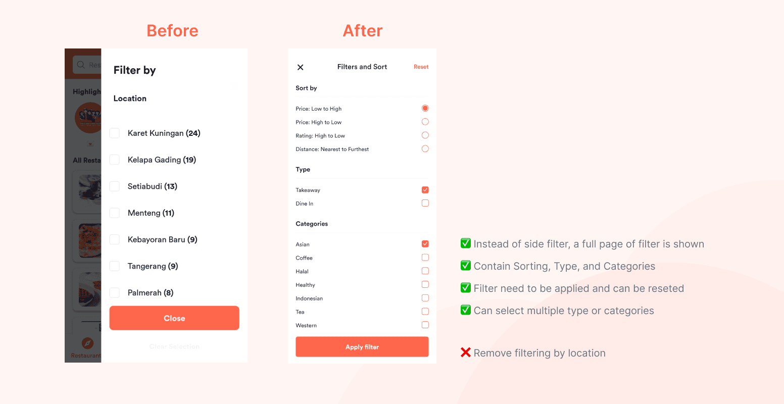
Filter: Filter is fully revamped. Before the revamped, filter is only to choose available location with no any other options. I tried to gain insights from user on what are they looking for when they use Eatsy.
Replacing location filter with a new filter selection based on what user needs. I’ve been through user pain points and needs and discovering some insights. Most of them using Eatsy to find the nearest restaurant around their area to make an order because they feel it’s saving their time rather than waiting in line or finding a restaurant that is not a lot of customers.
Based on that, the default of Eatsy sorting is based on the nearest restaurant around the user area and not by rating or price. And because of that as well, there’s no sorting from furthest restaurant to the nearest because of their behavior on finding restaurant and make transaction.
Another changes is there are few section for filter and sort. Before the revamped, there’s only filter by location and now there’s 3 section; Sort, Type of Dining, and Categories. All this section is based on the discover above. User wanted to filtering out their food preference. For example, a muslim people wanted to find a halal food in Singapore, they just easily go to filter and select a Halal food categories to find Halal restaurant.

Card Listing: The current card listing are looking the same and providing common information; restaurant name, location and category. Not a single card giving a context that this restaurant have a 20% discount, the restaurant closed, or opening soon in a few hours.
By giving a discount badges, restaurant availability, and rating, it will raise the awareness of user on the current ongoing promo and how the other feels to any restaurant. Curious user will try to make an order from the restaurant based on the rating or promo badges shown, leading more transaction and gaining more attraction.
Closed and opening restaurant will be notified as well as soon as user see the image of the restaurant. There’s a status of the restaurant if it’s closed or opening soon on the image. So, they can expect when to order or to looking any other restaurant if it’s closed.
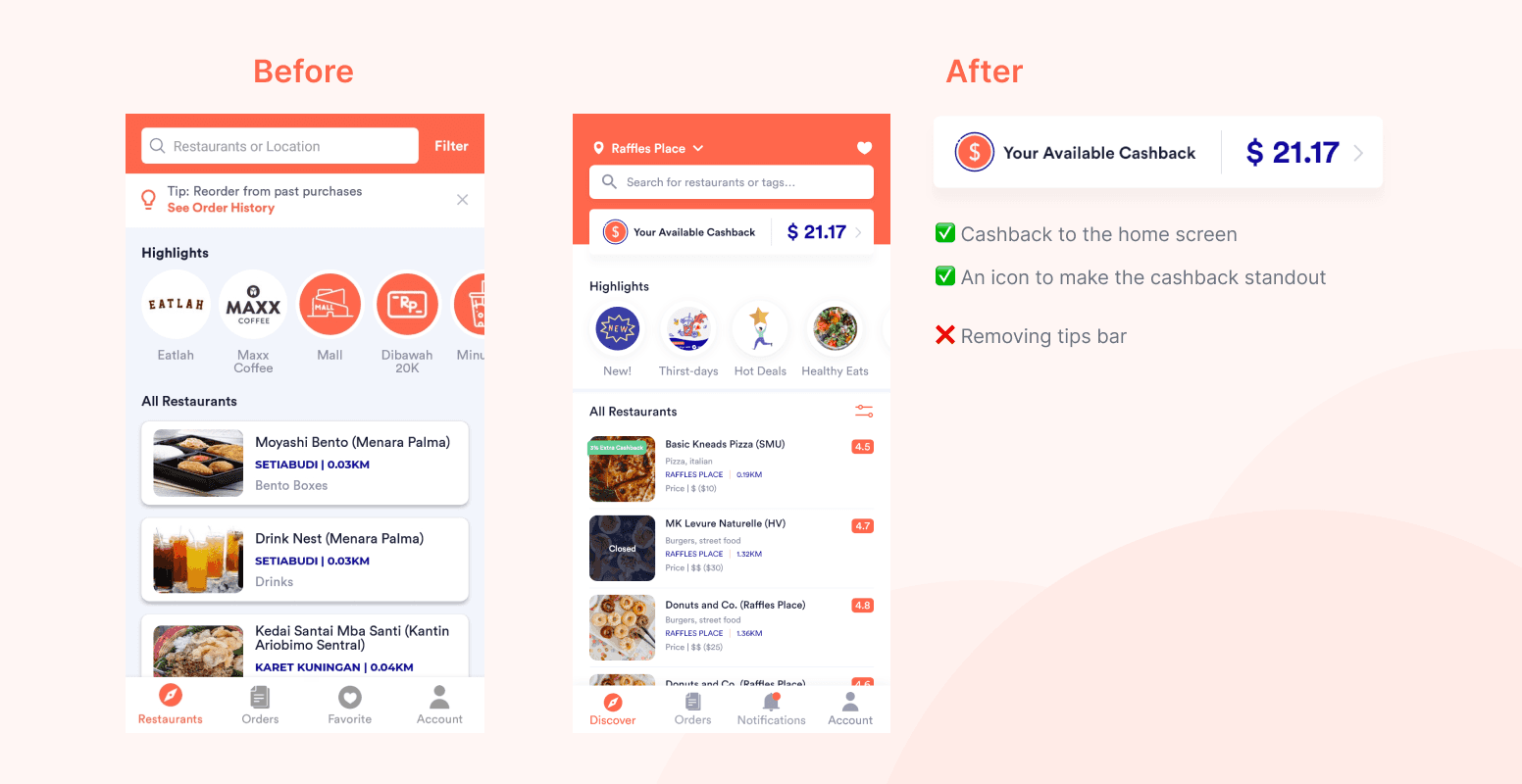
Cashback: Adding Cashback feature to home screen is one of our goals to show our unique selling proposition. Why adding this to our home screen? We wanted to show something different and Cashback give us the answer apart from the Cashback feature is a bit hidden since it’s only can be accessed from the profile screen, in which not a lot of user opening their profile screen as much as the home screen.
By introducing this feature to home screen, not only does it provide contrast, but it also let the user know that this feature exists and can be used.

Bottom Navigation: Last minor update is bottom navigation. There’s only one change on the navigation as the favorites replaced by notification. The main reason of replacing favorites with notification is because it’s barely visited by user. Our data only shows below 5% of them visiting the features monthly.
Instead of removing favorites completely, it’s moved to top right on the same row as location. Favorites is still a useful feature even though maybe not a lot of user using this and opening the favorites screen. It’s to bookmark user favorite restaurant so they can order their food faster by navigating to their regular restaurant.
The idea behind replacing it with notification is because we want to store all promos, cashback notif, and announcement into one feature. This is to make the user easier to find their promos instead they have to remember the promo codes, notified the cashback used or gained, and even announcement from Eatsy regarding the app maintenance, survey or trouble.
Final Design
After all ideas designed and explained, it comes to the final design for Eatsy home screen with some improvement.

Conclusion
As this project comes to an end, unfortunately it didn’t go live. But, we have tested the new Eatsy to limited user in order to gain more insights from what we have done. There are few things we can take for the home screen:
1.
Clear and Clean
The user feels that the UI is more clean and have a better visibility since the visual hierarchy is better to understand. Using a white background and reducing shadows blur and opacity making it more cleaner UI than before.
2.
Getting the Job Done
Better hierarchy and visibility means user can do their job easily. They just can spot on on what are they looking for. Finding foods can be done in variety way. Search your favorites restaurant, finding nearest restaurant, find the cheapest one, or even find their favorites cuisine and snack through filter categories.
Lesson Learned
Eatsy project gives me a lot of lesson I’ve never experienced before. It’s my first collaboration with the peoples outside my country, getting through ideas together, exchanging feedback not only from one team but from other team or division as well like marketing, business, or even ops, getting my first ever user test and interview as a leader and more lesson I can’t be mentioned one by one.
Overall from Eatsy I’ve learn something new and different from before and I’m glad working with those people from Eatsy to gained a good experience from the project.
Designed by Faiz
2023