Quokka - Improving Goal OKR

Role
UI/UX Designer
Time
2021-2023
Team
Product, Engineer
Overview
Quokka is a SaaS cloud-based people management platform which helps companies develop an engaged and high-performing teams. I joined Quokka as a UI/UX Designer in 2021. Being the sole designer, my responsibilities cover everything.

Problem
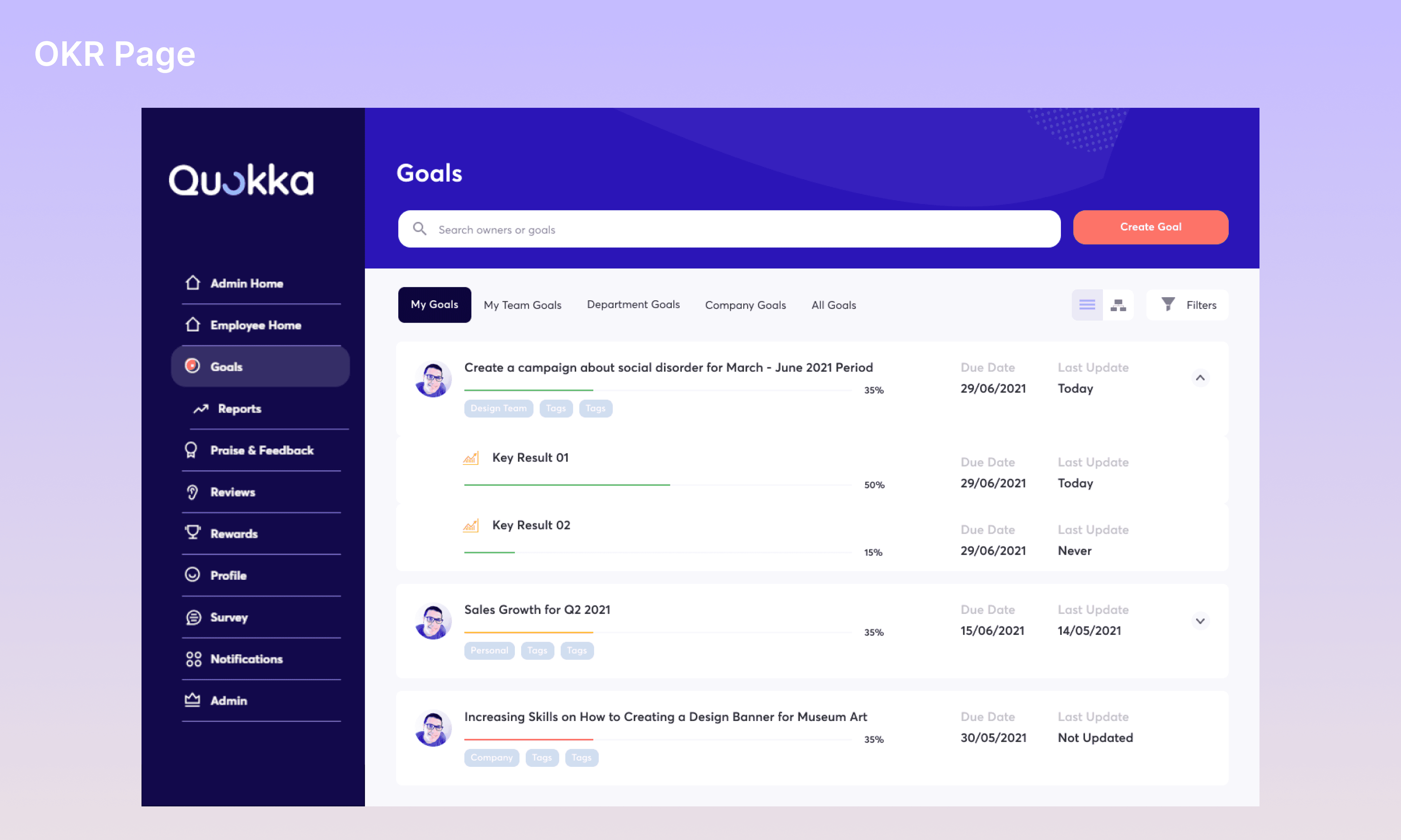
The initial design of OKR Goals was to create goals as quickly as possible, but it turns out that there are some problem need to address.
Need a seamless way to create and update OKR
The users sometimes finding it hard to create and update their OKRs because of they don't know how to perform the action.
Bulky UI and UX
There are some inconsistent component through creating and viewing OKR Goals, messy hierarchy, lots of friction, doesn’t have clear instruction or CTA.
Goals
Easy to Use
Creating, editing, or updating the OKR more easy with less clicks and focusing on action.
More Engagement
Playing around on OKR and discover the features that help your work.
Assessing
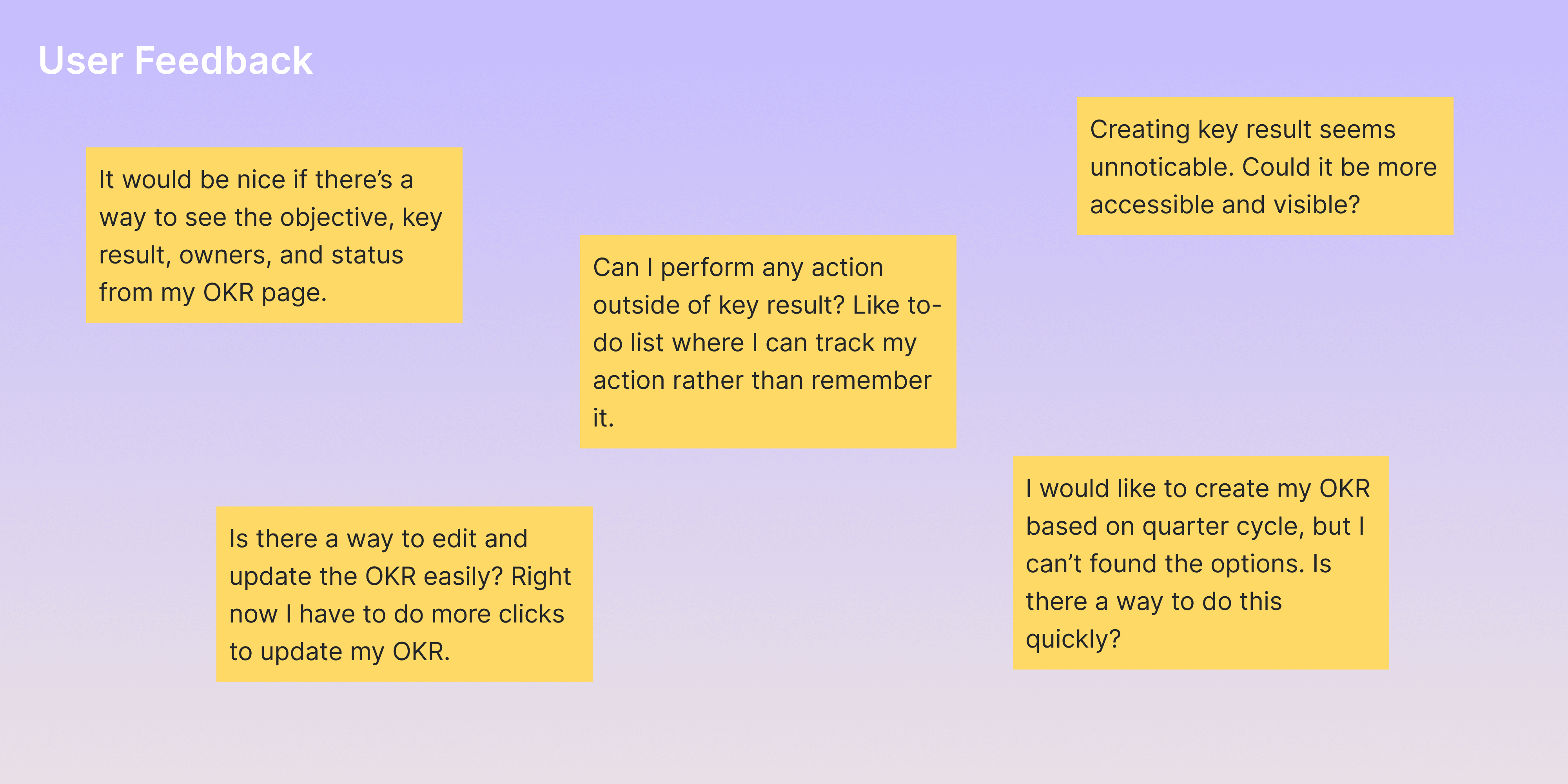
Before going to decide in which areas we should improve, I tried to take a look at the user feedback and assessing the OKR page and flow in order to gain more insights and understanding the problems.

Improvement Areas
1.
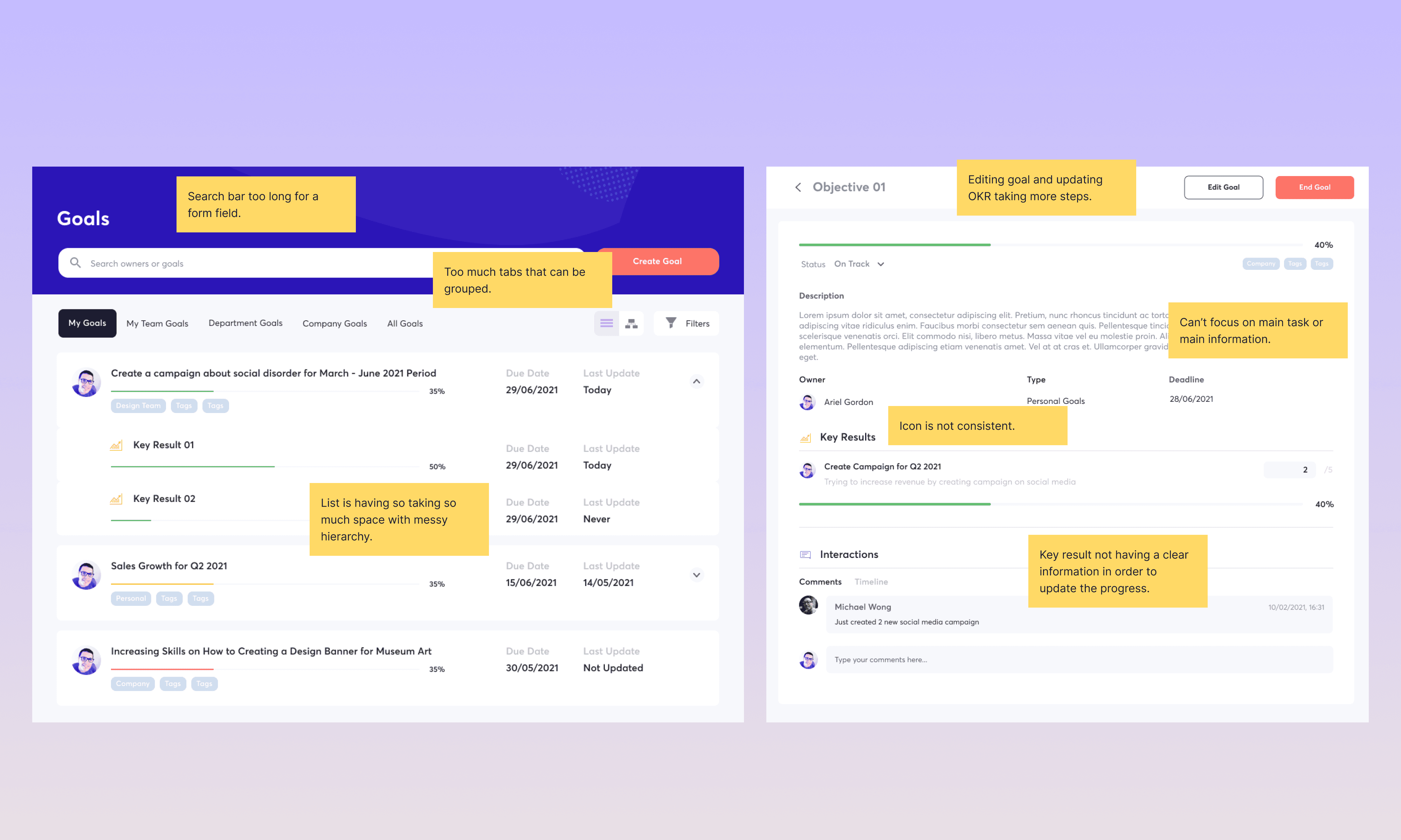
Hierarchy
The hierarchy when entering the goals OKR page seems messy. With a lot of information needed to be seen by the user, the card listing is not providing enough information for them. There’s a lot of tab as well which can be grouped into more general options.
2.
Scanning
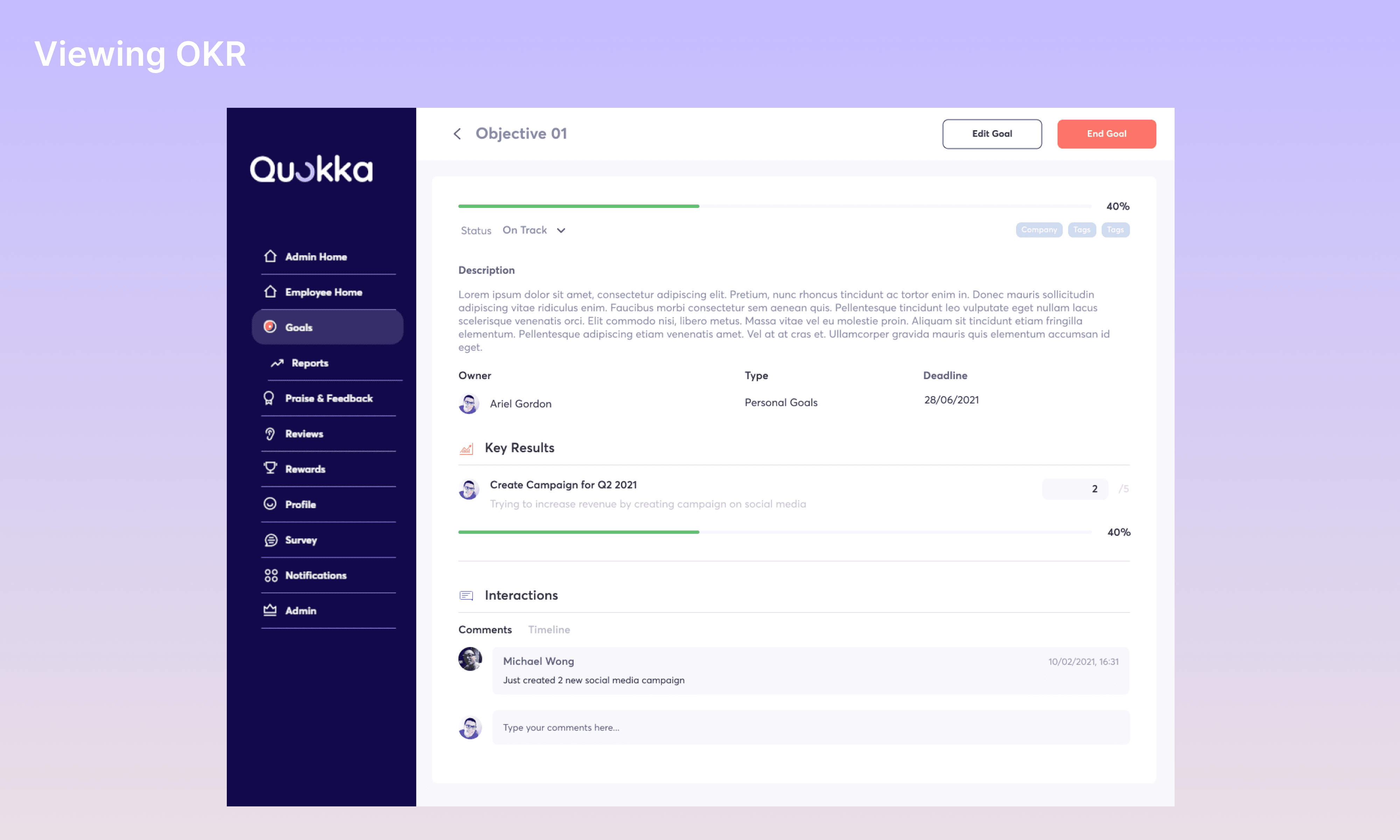
It might be a direct scan from top to bottom when creating OKR, but it requires a few step or field needed to fill before perform the actual action which is adding or creating key results.
3.
New Features
There are few improvements need to be added to OKR page. This improvement will help or boost the experience when creating or viewing OKR.
Breakdown
There are few exploration during the process and consideration between me and the engineer team as well as the stakeholder. We agree that we want the user to to focus on the goals and it’s key result before continuing on the other aspect.

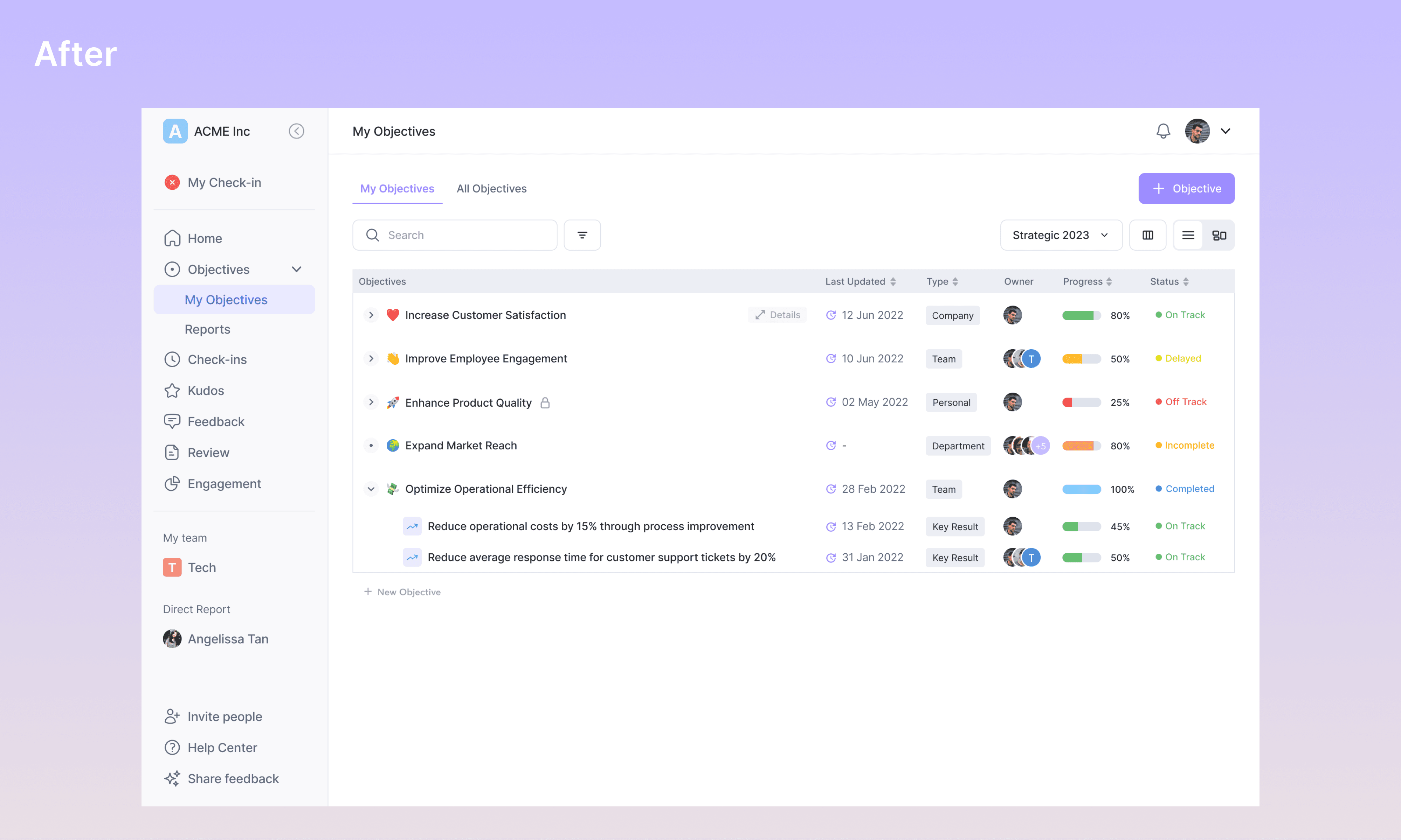
Hierarchy: There are many messy visual hierarchy which everything is having different alignment, component size, color and others. With the amount of data needs to be shown in the card, the user seems lost some kind of information on what they need to understand. There’s no OKR status for them to see, is it on track, off track, or even completed. The other problems are search field is too long, a lot of tabs which can be grouped to reduce the repetitive, and OKR card took so much space of the screen.
I created a brand new looks and experience for OKR. To achieve that, I changed the view from card list to table list. This make it easier for user to understand their OKR list, reducing the use of space in the screen which means user can see a lot of objectives in a single screen, and able to change their column options for viewing such amount of information. Grouped some of the tabs and reduce it to 2 tabs: My Objectives and All Objectives (viewing all objectives in the company from the others).
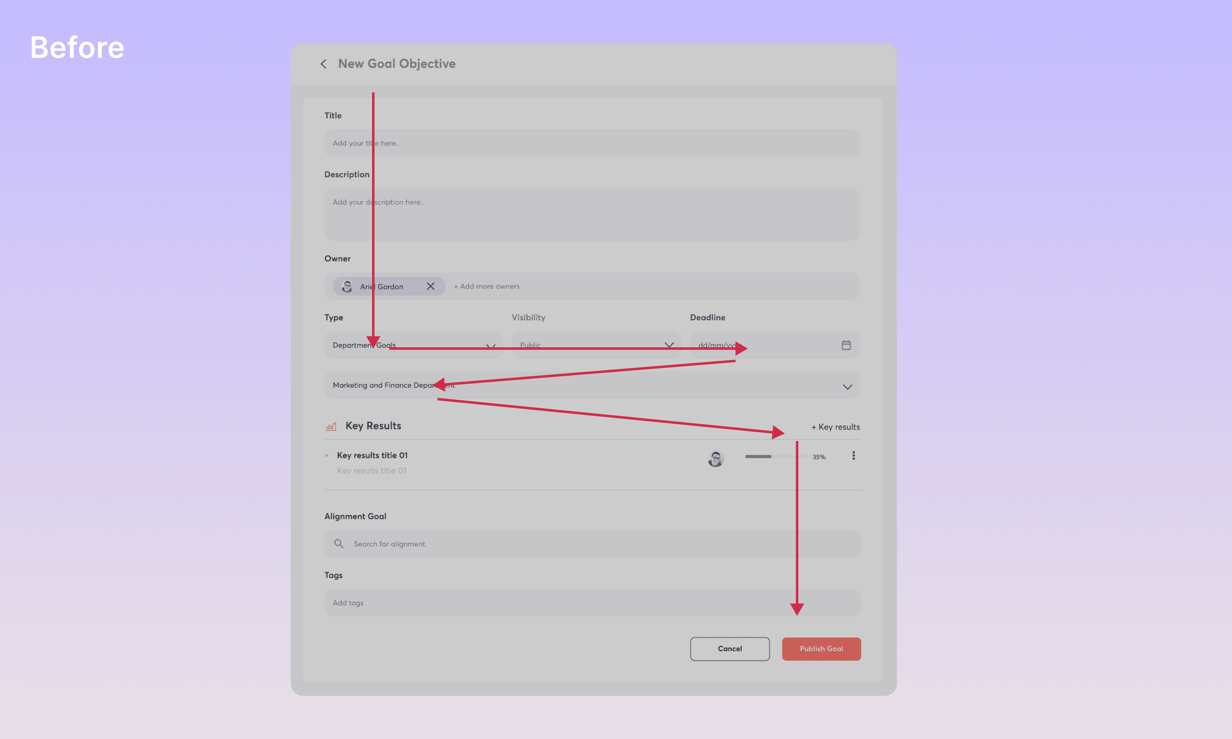
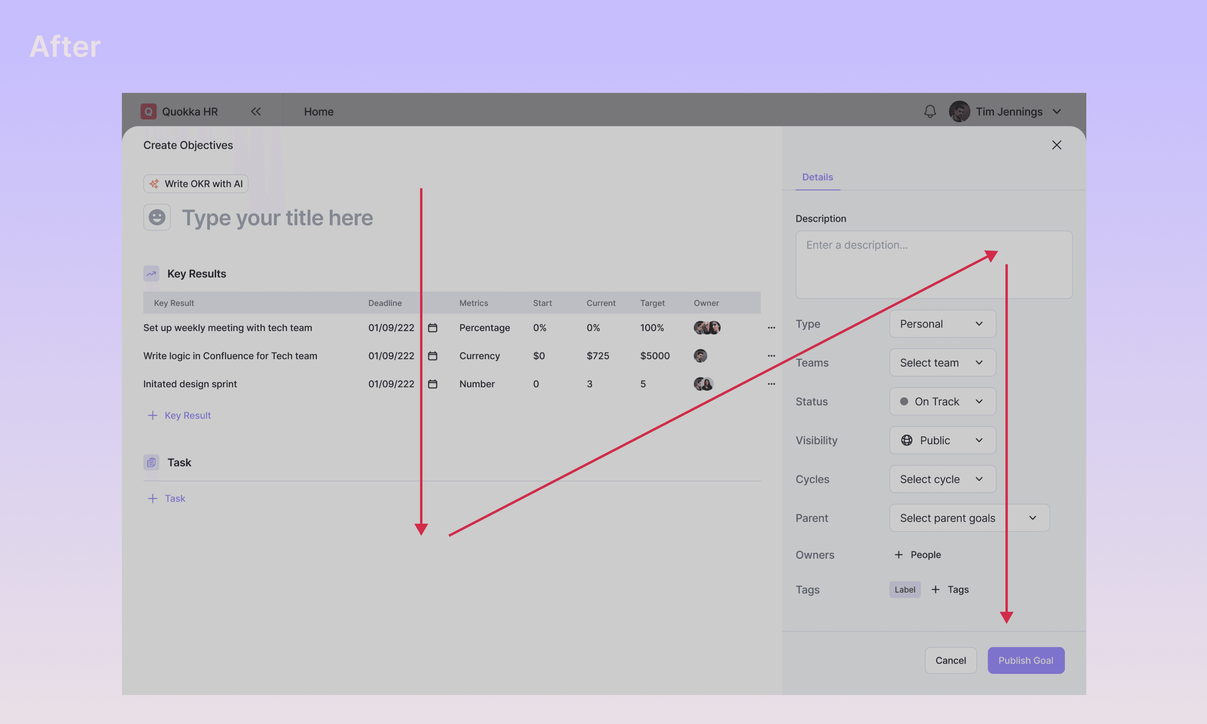
Scanning: The eye movement is kind of confusing, having to fill out unimportant information before actually going to fill the main action. In this case, the main action was to create the objectives and key result. It used to be zig-zag eyes movement before creating the key result.
The new looks will be more natural to see as the user can see and scan their main actions quickly from top to bottom before going in to the right side to choose their objectives details such as type of objectives, selecting teams, status, visibility, selecting objectives cycle, choosing owners, and their parent obectives.
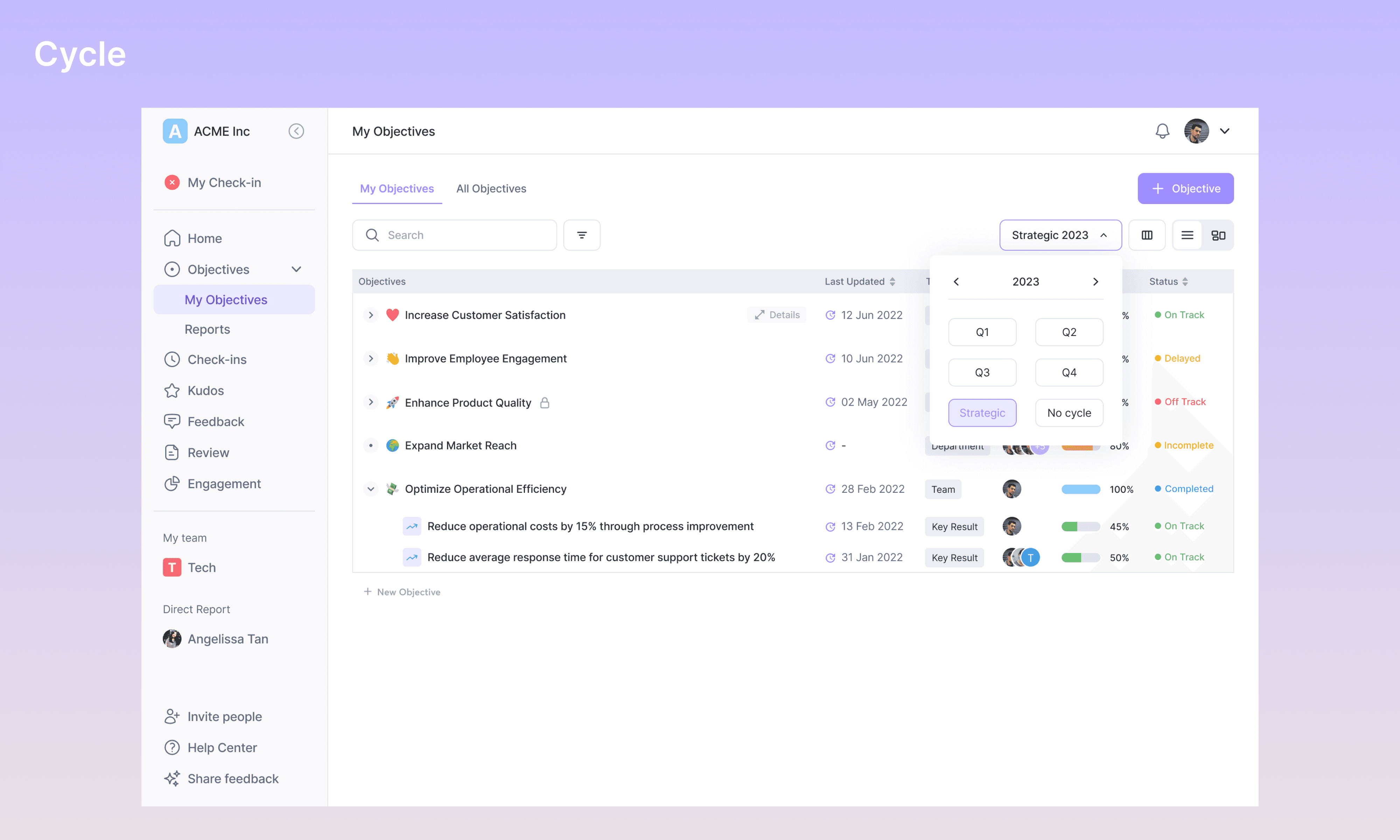


New Features: Apart from the original OKR page, I’ve added few improvements which might be helpful for the users. The first improvement is changing the deadline date for goals to cycles and keeping the deadline for key result. The use of cycles is because it will keep everyone align with the business strategy for that year while deadline for key result only last for the selected cycle. The cycles split into 3 categories; quarters, strategic year, and without cycle.
Viewing and updating your OKR progress now seems to be more easy with editable inline field. Choose your goals or key result and update it by change the value metrics. There’s also a graphic chart showing your OKR progress, your expected OKR progress, and who last updated the OKR.
Another improvement made is Task. The adding of task is basically for “to do” list the user needs to do in order to achieve their goal. The task is not something that will contribute to OKR, but only an action the user needs to do to complete the projects.
Prototype
I provide the prototype for OKR. Not all interactions are added and I just use instant animation for this study case purpose. You can just simply click here to go to the full prototype.
Lesson Learned
As the only designer in the team, revamping the whole platform seems impossible and taking a lot of time. But, I made it. In this case, the OKR has a lot of features, flows, and unexpected journey. A lot of research, seeing what the competitor doing, creating the journey, flows, design and discussing with the engineer to make it possible is a daily routine. Once the flow and design done, I tried to communicate with the engineer whether it’s possible to build and how many sprints they needed.
We (me and the engineer) were once face a situation where one of the features for OKR that can’t be build because it took a few sprint to complete. We decide to communicate with the stakeholders that we should make that feature not a priority, but more of future feature. They agree. The key of being solo designer and working in a team of one is communication within the others. I once learned that, because I’ve experienced when I’m not communicating enough with them, it’s just wasting time, maybe days, maybe weeks, maybe month, or even year and a delayed product isn’t a good option because we can’t test it on the market and not getting a feedback.
Quokka - Improving Goal OKR
Role
UI/UX Designer
Time
2021-2023
Team
Product, Engineer
Overview
Quokka is a SaaS cloud-based people management platform which helps companies develop an engaged and high-performing teams. I joined Quokka as a UI/UX Designer in 2021. Being the sole designer, my responsibilities cover everything.
Problem
The initial design of OKR Goals was to create goals as quickly as possible, but it turns out that there are some problem need to address.
Need a seamless way to create and update OKR
The users sometimes finding it hard to create and update their OKRs because of they don't know how to perform the action.
Bulky UI and UX
There are some inconsistent component through creating and viewing OKR Goals, messy hierarchy, lots of friction, doesn’t have clear instruction or CTA.
Goals
Easy to Use
Creating, editing, or updating the OKR more easy with less clicks and focusing on action.
More Engagement
Playing around on OKR and discover the features that help your work.
Assessing
Before going to decide in which areas we should improve, I tried to take a look at the user feedback and assessing the OKR page and flow in order to gain more insights and understanding the problems.
Improvement Areas
1.
Hierarchy
The hierarchy when entering the goals OKR page seems messy. With a lot of information needed to be seen by the user, the card listing is not providing enough information for them. There’s a lot of tab as well which can be grouped into more general options.
2.
Scanning
It might be a direct scan from top to bottom when creating OKR, but it requires a few step or field needed to fill before perform the actual action which is adding or creating key results.
3.
New Features
There are few improvements need to be added to OKR page. This improvement will help or boost the experience when creating or viewing OKR.
Breakdown
There are few exploration during the process and consideration between me and the engineer team as well as the stakeholder. We agree that we want the user to to focus on the goals and it’s key result before continuing on the other aspect.
Hierarchy: There are many messy visual hierarchy which everything is having different alignment, component size, color and others. With the amount of data needs to be shown in the card, the user seems lost some kind of information on what they need to understand. There’s no OKR status for them to see, is it on track, off track, or even completed. The other problems are search field is too long, a lot of tabs which can be grouped to reduce the repetitive, and OKR card took so much space of the screen.
I created a brand new looks and experience for OKR. To achieve that, I changed the view from card list to table list. This make it easier for user to understand their OKR list, reducing the use of space in the screen which means user can see a lot of objectives in a single screen, and able to change their column options for viewing such amount of information. Grouped some of the tabs and reduce it to 2 tabs: My Objectives and All Objectives (viewing all objectives in the company from the others).
Scanning: The eye movement is kind of confusing, having to fill out unimportant information before actually going to fill the main action. In this case, the main action was to create the objectives and key result. It used to be zig-zag eyes movement before creating the key result.
The new looks will be more natural to see as the user can see and scan their main actions quickly from top to bottom before going in to the right side to choose their objectives details such as type of objectives, selecting teams, status, visibility, selecting objectives cycle, choosing owners, and their parent obectives.
New Features: Apart from the original OKR page, I’ve added few improvements which might be helpful for the users. The first improvement is changing the deadline date for goals to cycles and keeping the deadline for key result. The use of cycles is because it will keep everyone align with the business strategy for that year while deadline for key result only last for the selected cycle. The cycles split into 3 categories; quarters, strategic year, and without cycle.
Viewing and updating your OKR progress now seems to be more easy with editable inline field. Choose your goals or key result and update it by change the value metrics. There’s also a graphic chart showing your OKR progress, your expected OKR progress, and who last updated the OKR.
Another improvement made is Task. The adding of task is basically for “to do” list the user needs to do in order to achieve their goal. The task is not something that will contribute to OKR, but only an action the user needs to do to complete the projects.
Prototype
I provide the prototype for OKR. Not all interactions are added and I just use instant animation for this study case purpose. You can just simply click here to go to the full prototype.
Lesson Learned
As the only designer in the team, revamping the whole platform seems impossible and taking a lot of time. But, I made it. In this case, the OKR has a lot of features, flows, and unexpected journey. A lot of research, seeing what the competitor doing, creating the journey, flows, design and discussing with the engineer to make it possible is a daily routine. Once the flow and design done, I tried to communicate with the engineer whether it’s possible to build and how many sprints they needed.
We (me and the engineer) were once face a situation where one of the features for OKR that can’t be build because it took a few sprint to complete. We decide to communicate with the stakeholders that we should make that feature not a priority, but more of future feature. They agree. The key of being solo designer and working in a team of one is communication within the others. I once learned that, because I’ve experienced when I’m not communicating enough with them, it’s just wasting time, maybe days, maybe weeks, maybe month, or even year and a delayed product isn’t a good option because we can’t test it on the market and not getting a feedback.
Designed by Faiz
2023